
 Contact us


In September, we changed our website, logo,
and overall identity. Now we’re going to tell you why and what all this means.
We felt the need to update long ago, when
we realized that the website no longer solves our problems or corresponds to
the company’s position. We approached the task in a comprehensive way: we
thought about social networks, stickers, and branded merchandise.
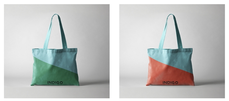
New INDIGO identity – bags
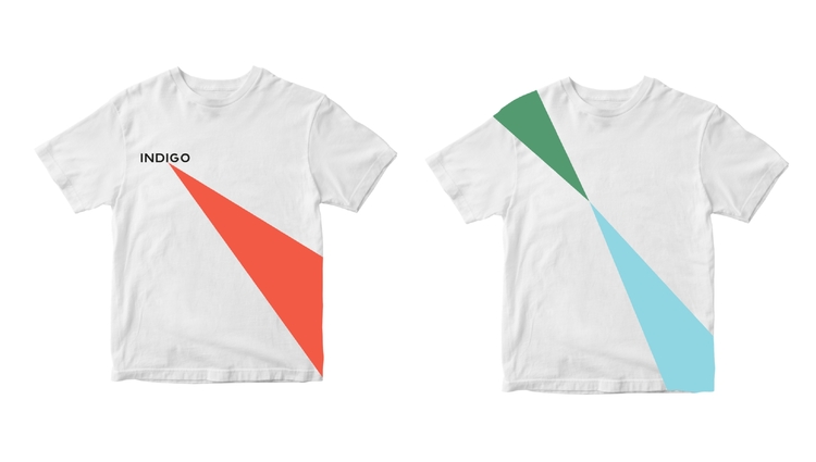
New INDIGO identity - T-shirts
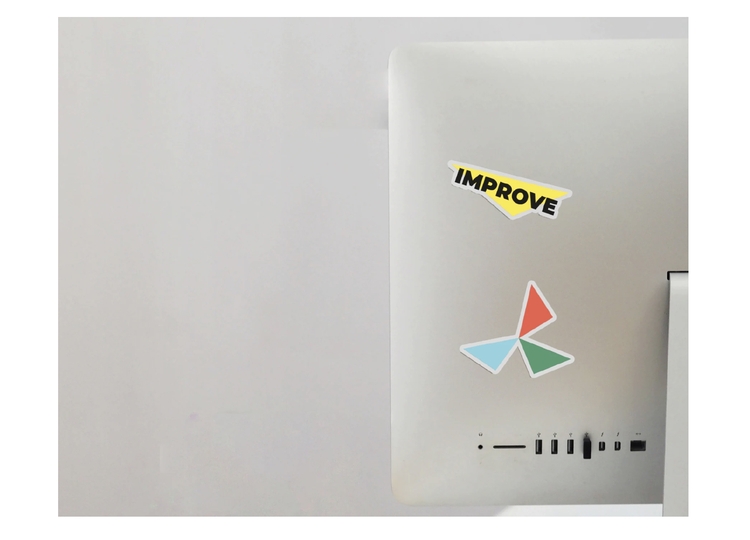
New INDIGO identity – stickers
Values
We believe that values determine a lot:
effective and comfortable cooperation with clients, partners, and the team — so
now we talk and write about them on the website, in our commercial offers, and
on social networks.
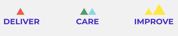
New INDIGO identity – values
Graphics and color
After a series of calls, discussions, and
surveys — and after trying three concepts — we came up with the final version
of our brand identity. A triangle became the symbol, the basis of everything.
In a triangle, everything loses its sense if you remove at least one of the
points. After all, everyone in this triangle is important and has a special
value. And this triangle is unique because it encapsulates new tasks, people,
and even distances between participants.

New INDIGO identity – philosophy
We liked this triangle so much that we
animated it and added it to the website in the “About Us” section.
Corporate graphics became a reflection of
our commitment to results, dedication, and dynamism.

New INDIGO identity – concept
The variety of colors indicates the
diversity of people on the team: everyone makes their contribution, each
contribution is valuable, each member enriches others with their experience and
vision. And together they are even stronger.
The color scheme consists of a number of
interrelated shades of color. So INDIGO creates the most harmonious teams and
finds the right people.
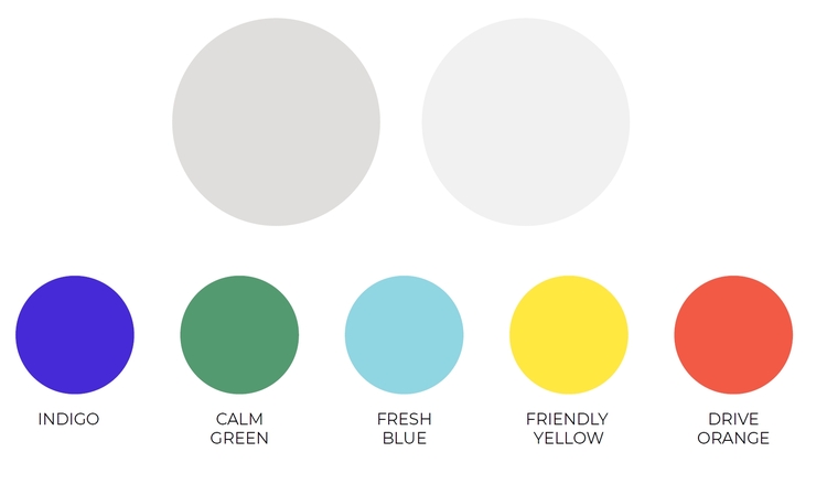
New INDIGO identity – coloristics
The logo and typography
Our new logo balances the drive of graphics
— it is geometric, minimalistic, and simple. We consciously refused additional
graphic symbols and images in the logo.
New INDIGO identity – logo
The letters of the logo made in a monoline
font emphasize our desire to adhere to our purpose, as well as our ability to
focus on it, embodying confidence, clarity, and reliability. The typeface of
text and headlines also serves the same purpose.
What else is new?
Along with the website, we transformed our
blog into a small media outlet about talent search and management. A visitor
can now search for published materials and view collections by tags. Also, you
can now send us an article for publication!
We have a
branded sticker pack in Telegram with very charming characters: https://t.me/addstickers/IndigoTechRecruiters
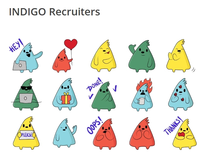
New INDIGO identity – stickers
We believe that our inner identity —
results, reliability, dynamism, and drive — now corresponds to how we look from
the outside.
Work on the
website continues. Stay tuned, we are preparing many more exciting updates for
you!